

Author Website Examples: 15 Sites That Turn Curious Readers Into Fans
Readers rarely leave a bad author website angry.
They simply disappear.
Someone finishes your novel at midnight, searches your name, lands on your site, and wants one thing: more. More books. The correct reading order. News about the next release. Maybe a newsletter. Maybe an event.
Instead, they find a five-year-old homepage, three broken social icons, a biography longer than the book description, and no obvious clue what to read next.
Click. Gone.
That is the real reason these author website examples matter. You are not studying fonts and hero images. You are studying what happens in the few minutes between “Who wrote this?” and “I want to keep following this author.”
Fresh 2026 reader data makes that worth taking seriously.Written Word Media surveyed 3,589 active readers and found that 30% reported discovering books through author websites, while 49% said they subscribe to author newsletters. The company notes that its audience skews toward highly active digital readers, so the results should not be treated as representative of every reader. They do, however, show that author-owned web and email channels remain part of real reader behavior in 2026.
Even BookBub's Author Websites product added built-in newsletter and welcome-email tools in May 2026, further connecting author sites with direct reader relationships.
The lesson is simple:
Your website should not merely prove that you are an author. It should make being interested in you easier.
Key Takeaways
Put your books and the reader's next decision ahead of your full life story.
Authors with several books should make series order and starting points obvious.
Give readers a reason to return, such as newsletters, future releases, bonus material, articles, events, or reader resources.
Match the website to your career. A debut novelist does not need the same structure as an author with seven series.
Judge design by what readers can find and do, not by how expensive the site looks.
What Should a Great Author Website Actually Do?
A strong author website should help a new visitor understand what you write, find the right book, decide what to do next, and stay connected. It should support discovery rather than create another obstacle between reader curiosity and your books.
Reedsy describes an author website as your “personal corner of the internet” for showcasing your work and connecting directly with readers. Its current author-website guide also emphasizes putting books, contact information, newsletter signup, and regularly updated content within easy reach.
But there is one extra question worth adding:
What happens after the reader finds everything?
That is where many sites stop too early.
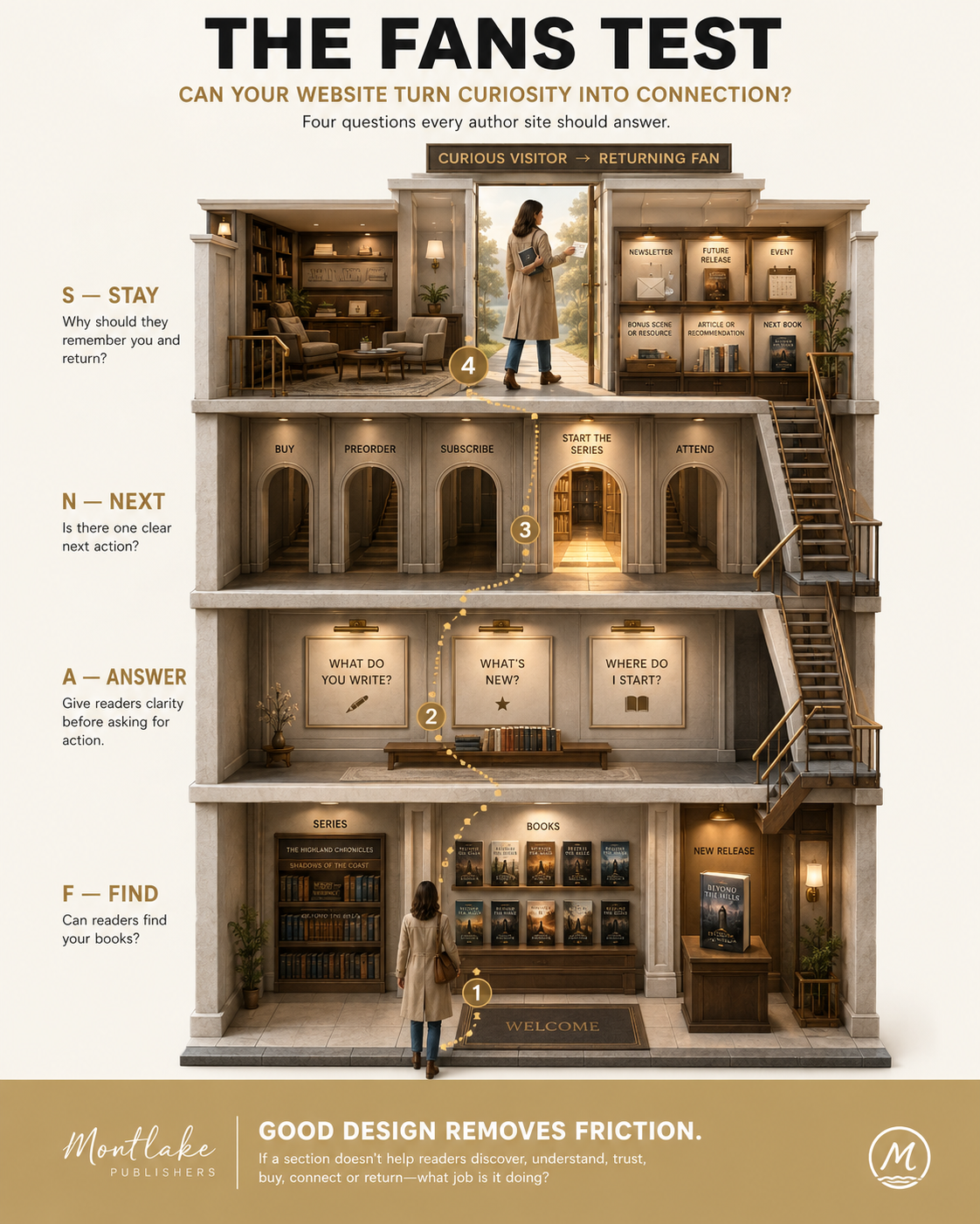
The FANS Test
Use this four-part test while reviewing the examples below:
F: FIND Can readers find your books without hunting?
A: ANSWER Can they quickly understand what you write, what is new, and where they should begin?
N: NEXT Is there a clear next action: buy, preorder, subscribe, explore the series, attend an event, or keep reading?
S: STAY Have you given them a reason to remember you and return?
You do not need a perfect score in every category.
You need a website designed around the relationship you actually want with readers.
15 Author Website Examples Worth Studying in 2026
1.Austin Kleon: Make the Website Feel Alive
Austin Kleon's website does not behave like a brochure someone launches once and forgets.
His books sit alongside an active blog and newsletter, and his current site also gives prominent space to his next book. His About page explicitly directs people toward the newsletter as a primary way to stay connected.
Why it works: Readers can enter through a book and stay for the ongoing thinking behind the books.
What to borrow: If regular writing suits your author brand, publish material people would willingly return to read. You do not need to blog weekly. You do need a reason for your website to feel current.
2.James Clear: Build a Reader Path, Not a Homepage Menu
James Clear's site knows exactly what its ecosystem contains: Atomic Habits, articles, his 3-2-1 newsletter, courses, an app, and related resources. The site keeps those paths distinct instead of hiding everything behind vague menu labels.
His newsletter also functions as a continuing relationship beyond the book.
Why it works: Visitors can move from one idea to a much deeper body of work.
What to borrow: Think beyond “visit my website.” Decide where different visitors should go next.
A first-time visitor and a committed reader may need completely different routes.
3.Brandon Sanderson: Answer “Where Do I Start?”
A large backlist can become a sales obstacle when a newcomer does not know which book belongs where.
Brandon Sanderson addresses that problem directly with a “Where do I start?” resource. Rather than dumping an enormous bibliography on the visitor, his site helps people select an entry point into his work.
Why it works: The website acts like a knowledgeable bookseller.
What to borrow: Once you have multiple books, especially interconnected series, create a beginner route.
“Books” is a library.
“Start here” is a decision.
4.V. E. Schwab: Recommend Books by Reader Taste
V. E. Schwab takes the “start here” idea further.
Her current site includes a dedicated starting guide built around what readers like, alongside book pages and a monthly newsletter.
That makes the site feel less like:
Here are all my books.
And more like:
Tell me what kind of reading experience you want.
What to borrow: Segment by reader preference when publication order is not the only factor that matters.
A fantasy author, for example, might guide visitors toward “romantic,” “dark,” “epic,” or “standalone” starting points.
5.Leigh Bardugo: Treat Reading Order as a Conversion Tool
Leigh Bardugo's website does not leave Grishaverse readers to piece together the sequence from retailer listings.
Her book pages repeatedly connect readers with the Grishaverse reading order, while the books area clearly organizes her wider catalog. Newsletter prompts also connect visitors with new books, tours, and giveaways.
Why it works: It removes uncertainty at the moment someone is considering another book.
What to borrow: If your books belong together, make the relationship visible.
Do not expect readers to perform detective work before giving you more money.
6.Rick Riordan: Organize Around Series, Not a Giant Catalog
Rick Riordan has enough books to make a flat archive exhausting.
His site instead presents major series and gives readers routes into individual books and reader resources.
That structure matches how fans think.
They do not necessarily think:
Show me every Rick Riordan title sorted by publication date.
They think:
I want more Percy Jackson.
What to borrow: Organize your website around the mental categories readers already use.
Series, characters, genres, universes, or subjects can sometimes make more sense than chronology.
7.Alice Oseman: Build for the Fan, Not Only the Buyer
Alice Oseman's web presence has to serve readers interested in YA novels, Heartstopper, events, adaptations, reading order, press information, and the wider world around the books.
The site includes dedicated Heartstopper event material, book-order guidance, and a press kit rather than forcing those audiences through the same generic page.
Why it works: Different kinds of interest receive different paths.
What to borrow: Once your work expands into adaptations, events, bonus material, speaking, teaching, illustration, or merchandise, build clear sections around those needs.
Fans are not all looking for the same thing.
8.Rupi Kaur: Let the Site Carry a Wider Creative Identity
Rupi Kaur's site connects books with her story, tours, newsletter, creative products, and other parts of her work.
The experience therefore feels broader than a standard author bibliography.
That makes sense for a writer whose readers may connect with the person, visual identity, performances, and creative world as strongly as with a single book.
What to borrow: When your author brand legitimately reaches beyond books, let the site reflect that.
Just do not bury the books while building the universe around them.
9.Mark Manson: Make the Copy Sound Like the Author
You could remove Mark Manson's name from much of his website and still have a good chance of identifying whose site it is.
The homepage, articles, newsletter positioning, and About page all carry the same direct personality associated with his work. His site also routes visitors toward his books, newsletter, articles, podcast, and video content.
Why it works: The website has a voice, not just a visual identity.
What to borrow: Your author brand does not live only in colors, typography, and photographs.
It lives in sentences.
10.Adam Grant: Turn Expertise Into an Author Ecosystem
Adam Grant's website serves people looking for books, articles, podcasts, speaking, research-driven ideas, and his newsletter.
His newsletter page states that it reaches more than 250,000 readers, showing how a website can sit at the center of a broader audience system rather than acting as an online book jacket.
What to borrow: Nonfiction authors should think beyond the book page.
If your writing is built on professional knowledge, your website may also need to establish what you know and where readers can experience that thinking next.
11.Stephen King: Become the Official Source
Stephen King's website has a different responsibility.
People already know who he is. The site needs to become the authoritative source for an enormous body of work, current news, FAQs, new releases, appearances, and official updates.
The site's works archive is extensive, while its 2026 news section and FAQ area remain active sources of current information.
What to borrow: As your career grows, the website's job can shift from introducing you to organizing you.
Readers should not need third-party fan pages to understand your own catalog.
12.Dav Pilkey: Design for the Reader You Actually Have
Dav Pilkey's website immediately feels different from a typical adult nonfiction author's site because it should.
The current homepage connects books with colorful visual material, trailers, videos, drawing-related content, and events around titles such as Dog Man and Captain Underpants.
Why it works: The format matches the audience and work.
What to borrow: Stop asking what an “author website” should look like.
Ask what your reader's version of an author website should feel like.
A children's author and a leadership writer should not end up with the same template wearing different colors.
13.Seth Ring: Give Genre Readers a Clear Home
Seth Ring's site is especially useful to study because it shows how a prolific genre author can make many books manageable.
His current site is organized around book series, while supporting areas include a newsletter and media kit. His media page states that he has published more than 40 LitRPG novels across several series.
What to borrow: Genre authors with large backlists should make series identity impossible to miss.
The easier the catalog is to understand, the easier it becomes to continue reading.
14.Colleen Hoover: Reduce the Distance Between Interest and Purchase
Colleen Hoover's site gives readers direct access to books and shopping routes, while her individual book pages provide purchase options rather than turning discovery into a scavenger hunt.
Her About page also connects her authorship with screenwriting and production work, giving established fans a broader picture of her current creative career.
What to borrow: When readers arrive with high intent, get out of their way.
Book pages should make buying, browsing, and understanding related titles straightforward.
15.Elizabeth Gilbert: Give the Relationship Somewhere to Continue
Elizabeth Gilbert's website connects her books and biography with a newsletter and events rather than treating publication as the end of the reader relationship. Her current events archive and LizNews signup remain distinct parts of the site.
What to borrow: Your website should answer one important post-book question:
Why would someone return when they are not buying anything today?
That answer could be news, essays, events, recommendations, a newsletter, teaching, bonus material, or access to the next project.
What Do These 15 Author Websites Have in Common?
They do not share one design style.
That would be a terrible lesson to take from them.
Instead, they repeatedly solve the same reader problems in different ways:
| Reader Need | Website Feature That Helps | Strong Examples |
|---|---|---|
| “What does this author write?” | Clear positioning and book visibility | Mark Manson, Adam Grant |
| “Where should I start?” | Starting guides | Brandon Sanderson, V. E. Schwab |
| “Which book comes next?” | Series and reading-order pages | Leigh Bardugo, Rick Riordan, Seth Ring |
| “What's new?” | Current releases and news | Stephen King, V. E. Schwab |
| “How do I keep in touch?” | Newsletter signup | Austin Kleon, James Clear, Rupi Kaur |
| “Can I buy this now?” | Clear retailer or store paths | Colleen Hoover, Alice Oseman |
| “What else is here?” | Articles, podcasts, events or fan material | Adam Grant, Alice Oseman, Dav Pilkey |
| “Is this the official source?” | Complete author and media information | Stephen King, Elizabeth Gilbert |
The best feature is not the one everybody else has.
It is the one that removes friction for your reader.
Why Email Belongs Inside the Author Website Conversation
A website visit is valuable.
A website visit that becomes permission to contact the reader again can be much more valuable.
In the same 2026 Written Word Media survey, 49% of respondents said they subscribe to author newsletters, while future projects were the thing readers most commonly wanted to hear about from authors, at 67%.
This does not mean throwing a giant newsletter popup over someone's screen before they have read the author's name.
It means giving the signup a reason to exist.
Compare these:
Weak:“Join my newsletter.”
Better:“Get the first chapter of Book Two and hear when preorders open.”
Weak:“Subscribe for updates.”
Better:“Get monthly reading recommendations, research notes, and news about my next history book.”
The second version answers the question every signup form quietly asks:
What's in it for me?
What Most Author Websites Get Wrong
They Put the Author Before the Reader
Your life story matters.
It just may not be the first thing a reader came to find.
Do this: Lead with your books, genre, current release, or strongest reader promise.
Not that: Make someone scroll through your childhood, pets, degrees, hobbies, and writing philosophy before discovering what you wrote.
They Give Every Action Equal Importance
Buy.
Subscribe.
Follow.
Watch.
Contact.
Read.
Shop.
Attend.
If everything screams, nothing leads.
Pick a primary action for each page.
They Hide Reading Order
This becomes painful once series and spin-offs multiply.
If readers are repeatedly searching Google for the correct order of your own books, consider solving that problem on your own site.
They Build a Beautiful Dead End
Someone visits. Looks around. Leaves.
No signup.
No related book.
No next release.
No event.
No useful resource.
No reason to return.
That is not a reader journey. It is a display cabinet.
They Copy Famous Authors Too Literally
Stephen King needs an enormous works archive.
You probably do not.
James Clear has multiple products around one globally recognized nonfiction brand.
You may only need one strong book page and an email signup.
Study the decision logic, not the page count.
Which Author Website Structure Fits Your Career?
A useful site grows with the work.
| Author Stage | What You Probably Need First | What Can Wait |
|---|---|---|
| Writing first book | Home, short About, email signup, contact | Large blog, shop, complex media library |
| Debut approaching launch | Home, book page, About, email, retailer links | Huge archive |
| 2–5 books | Individual book pages, series grouping, newsletter | Complex fan ecosystem |
| Several series | Reading order, start-here page, series hubs | More generic promotional pages |
| Nonfiction expert | Books, About, articles/resources, media, speaking, email | Fiction-style worldbuilding sections |
| Children's author | Books, visual resources, events, educator/parent material where relevant | Corporate-style thought leadership |
| Established author | Catalog, news, media, events, newsletter, official information | Anything that does not serve the audience |
Your website should become more sophisticated because your publishing career requires it, not because a web designer has more things to sell.
An Illustrative Example: The Fantasy Author With Four Doors and No Entrance
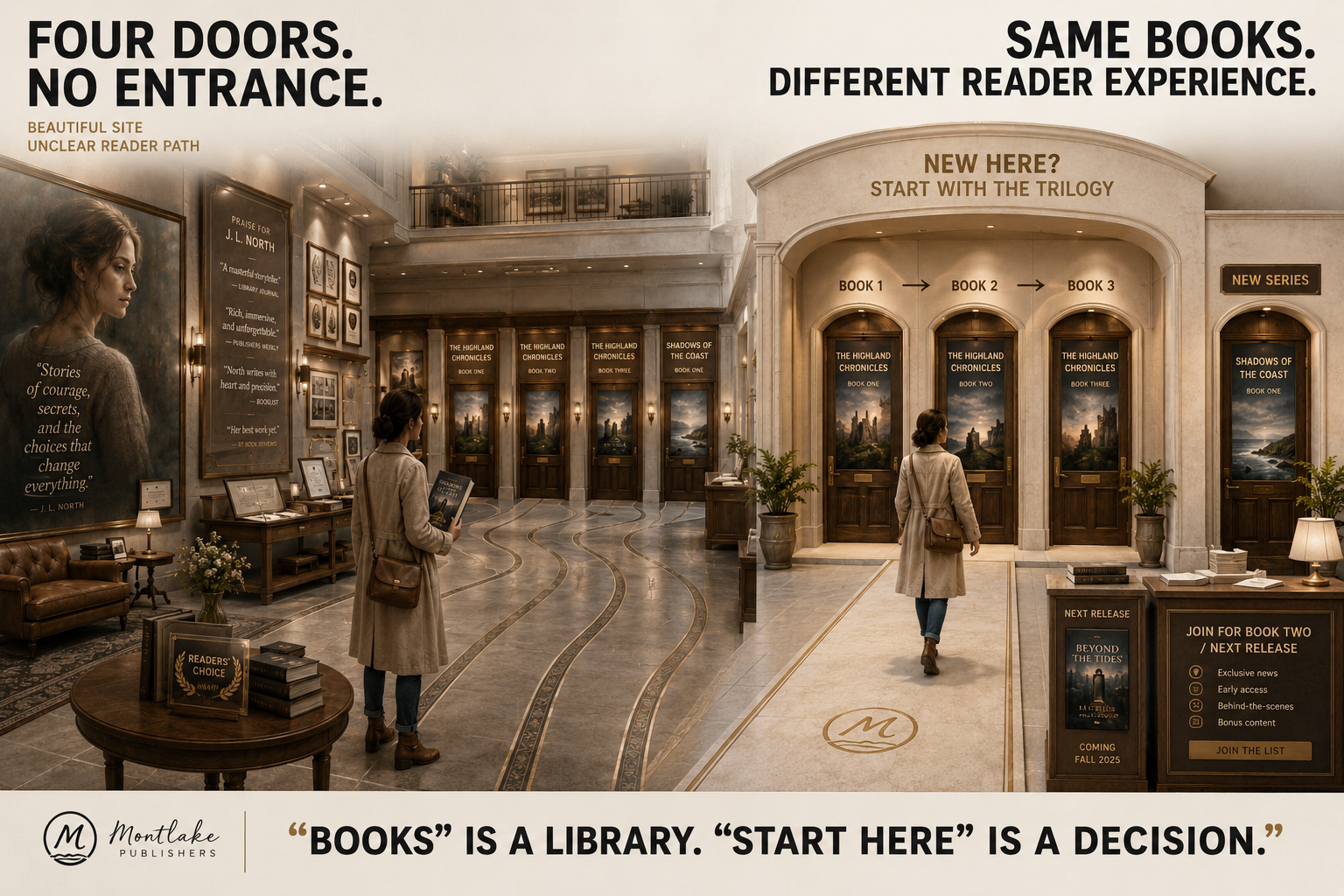
Picture a fantasy author with four novels.
Books one to three form a trilogy. Book four starts a new world.
The homepage opens with the author's portrait, then testimonials, then a biography. All four covers appear much farther down. Nothing explains which titles connect.
A new reader has heard about Book Three from a friend.
They arrive.
Now they need to work.
A stronger site could solve the entire problem near the top:
New here? Start with the trilogy.
Then:
Trilogy overview
Book One CTA
Reading order
New series introduction
Newsletter for the next release
Same books.
Same author.
Completely different reader experience.
That is what the strongest author website examples teach better than any list of recommended fonts.
How to Audit Your Author Website in Five Steps
1. Arrive as a Stranger
Open your homepage and pretend you have never heard of yourself.
Within a few seconds, can you tell what kind of author you are and what readers can find here?
2. Try to Find the Right First Book
Do not use your site's search function.
Can a new reader tell where to begin?
If not, create a stronger book hierarchy, series page, or starting guide.
3. Identify the Main Next Action
What should a curious visitor do after looking around?
Buy?
Preorder?
Subscribe?
Explore another series?
Choose one primary action for that moment.
4. Test the Relationship After the Sale
What remains useful after someone owns the book?
Think newsletter, events, book-club material, articles, bonus scenes, resources, interviews, future-project updates, or another title.
5. Delete What Has No Job
Every section should help readers discover, understand, trust, buy, connect, or return.
If it does none of those things, ask why it is occupying the page.
Where Professional Author Website Design Fits
Looking at excellent websites can clarify what you like.
It does not automatically tell you what your site needs.
A memoir author launching one book has a different reader path from a LitRPG author managing forty titles. A business writer may need speaking and media sections. A children's author may need visual resources and events. A novelist with several connected books may need series hubs and reading-order guidance.
That is the problem professional author website design should solve.
Montlake Publishers currently describes its process around consultation and objectives, site customization, book and content integration, and support beyond launch.
The site can also connect naturally withbook marketing services when reader discovery is part of the goal,book cover design when the visual identity needs stronger continuity, andbook publishing support when the website is being prepared around an upcoming release.
Final Thoughts
The best author website examples do not give you fifteen designs to copy.
They give you fifteen decisions to think about.
Austin Kleon shows what happens when the site stays alive. Brandon Sanderson and V. E. Schwab reduce the anxiety of choosing a first book. Leigh Bardugo and Rick Riordan make connected catalogs easier to understand. Mark Manson demonstrates what strong author voice looks like outside a manuscript. Dav Pilkey reminds us to design for the actual reader. Stephen King shows why an established author site eventually becomes the official archive.
Your version may need only five pages.
That is fine.
Run it through the FANS test:
Can readers Find?Can the site Answer?Is there a clear Next step?Is there a reason to Stay connected?
If those four things work, your website is doing something far more useful than looking professional.
It is helping a curious visitor become a reader who remembers your name.
Give Readers Somewhere Worth Returning To
Your books may already be earning curiosity.
The website's job is to stop wasting it.

If readers cannot tell where to begin, what comes next, or how to stay connected, review the structure before adding more pages.Montlake Publishers' Author Website services can help you plan a site around your books, readers, and publishing goals rather than another generic author template.
Frequently Asked Questions
What should an author website include?
Most author websites should include a clear homepage, book pages, an author biography, buying or retailer links, contact information, and a way to stay connected. Authors with several titles may also need series pages, reading order, events, media information, FAQs, newsletters, or reader resources.
Do authors still need websites in 2026?
Authors can publish without their own website, but a website gives them an online destination they control. Fresh 2026 Written Word Media survey data also found that 30% of its active-reader respondents reported using author websites to discover books. (Written Word Media)
What pages should a fiction author's website have?
A fiction author can usually begin with Home, Books, About, and Contact or Connect pages. Series authors should consider adding series hubs and reading-order guidance. Bonus content, events, newsletters, character material, maps, or other reader features should be added when they serve a clear purpose.
Is an author website better than social media?
They serve different purposes. Social platforms can introduce people to an author inside another company's network. An author website provides a permanent destination for books, biography information, newsletters, contact details, events, media material, and reader resources. Many authors use both rather than treating them as substitutes.
Can an author website help sell books?
It can support book sales by making titles easier to understand and buy, directing readers toward retailers or direct-sales options, clarifying series order, supporting launches, and keeping interested visitors connected. A website cannot guarantee sales, and its value depends heavily on traffic, book positioning, and reader experience.
Should every book have its own page?
Important books generally benefit from individual pages when readers need descriptions, formats, retailer links, reviews, series information, bonus material, or other title-specific details. Authors with very small catalogs can keep the structure simple, while large backlists benefit from stronger category and series organization.
Should an unpublished author have a website?
An unpublished author can benefit from a simple site when it has a genuine job, such as establishing their name, collecting interested email subscribers, providing contact information, or preparing for a forthcoming release. Building dozens of empty pages before the first book exists rarely improves the reader experience.
How much does a professional author website cost?
The cost depends on scope. A simple informational site and a custom author platform with book catalogs, newsletter integration, ecommerce, media pages, events, ongoing content, and custom development involve very different workloads. Ask for a written scope covering design, development, hosting, maintenance, integrations, and ownership before comparing quotes.
What makes an author website look professional?
Professional presentation comes from clarity more than decoration. Readers should encounter readable typography, strong book imagery, consistent branding, current information, straightforward menus, sensible page hierarchy, and clear actions. The site should also work around the author's genre, catalog size, audience, and publishing goals rather than looking like a generic template.
Can Montlake Publishers build an author website around my books and brand?
Montlake Publishers offers author website services covering consultation, visual customization, book and content integration, launch preparation, and continued website support. The appropriate structure should depend on your catalog, reader journey, publishing stage, brand, and what you want visitors to do next.


