

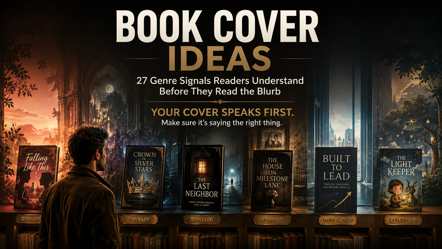
Book Cover Ideas: 27 Genre Signals Readers Understand Before They Read the Blurb
Your cover can be beautiful and still tell the wrong reader, “This book is not for you.”
That is one of the more expensive creative mistakes an author can make.
A cozy romance dressed like a psychological thriller may look polished. A business book wrapped in dreamy fantasy art may be beautifully illustrated. A dark horror novel with cheerful rom-com typography may attract attention.
The problem is that attention alone is not the job.
Strong book cover ideas communicate something before the shopper reads the title carefully, opens the description, recognizes the author, or checks a review.
They whisper clues:
romance.
danger.
magic.
grief.
authority.
adventure.
This belongs on your shelf.
That visual communication is not merely designer intuition. A 2026 peer-reviewed study published in the IEEE IMCOM proceedings analyzed 11,195 Amazon books and extracted ten cover characteristics involving color, layout, typography, and object type. The researchers then used reader testing to examine how design recommendations related to purchase intention.
The useful lesson for authors is not that there is a mathematical formula for a bestseller.
There isn't.
It is that color, type, imagery, and composition carry information.
Your job is to make that information say the right thing.
Key Takeaways
Readers use visual cues to make fast assumptions about genre, mood, audience, and reading experience.
Genre conventions are useful signals, not templates that every book must copy.
The strongest cover usually combines familiar category cues with one memorable story-specific idea.
A design should work both as full-size artwork and as a small retail image.
Study your subgenre and current comparable books, not merely bestselling books in fiction as a whole.
What Makes a Strong Book Cover Idea?
A strong book cover idea tells the right reader what kind of experience awaits them while leaving enough curiosity to make them look closer. Genre, emotional tone, typography, imagery, color, and composition should work together. The cover should feel familiar enough to classify quickly, but specific enough not to disappear among neighboring books.
That balance matters.
If your design ignores every convention, readers may struggle to classify the book.
If it copies every convention, they may barely notice it.
Think of genre design as language.
You can write an original sentence without inventing a new alphabet.
Use the COVER Test Before Falling in Love With a Design
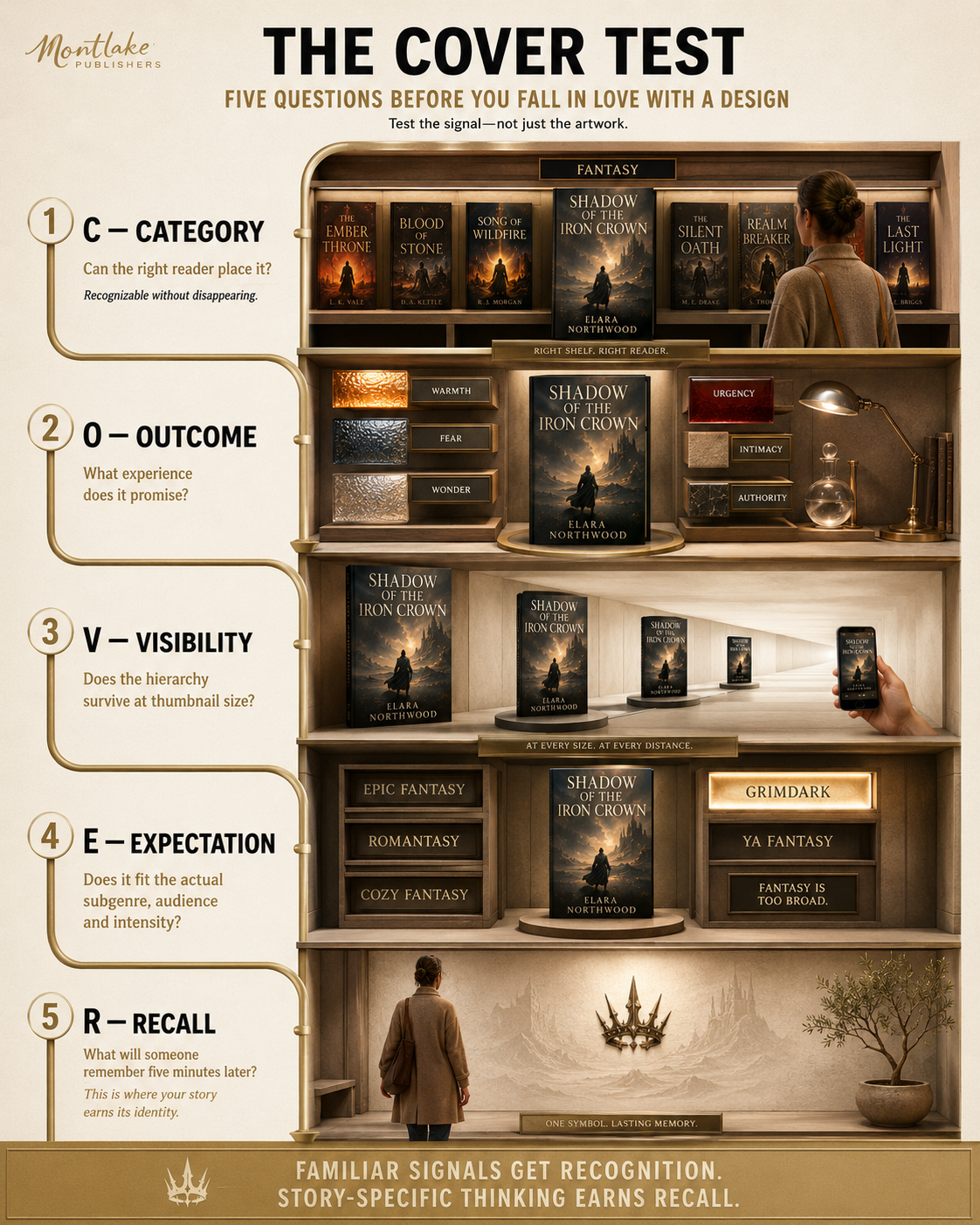
Before approving any visual direction, test it against five questions.
C: Category
Could your intended reader make a reasonable guess about the genre?
O: Outcome
What emotional experience does the cover promise?
Warmth? Fear? Wonder? Urgency? Intimacy? Authority?
V: Visibility
Does the title survive when the artwork becomes a small thumbnail?
E: Expectation
Does the design fit the actual subgenre, tone, age group, and heat or intensity level?
R: Recall
What is the one element somebody might remember five minutes later?
Genre conventions get readers through the first four questions.
Story-specific thinking earns the fifth.
Why Genre Signals Matter More Than Random Originality
Authors sometimes resist genre conventions because they do not want their books to “look like everybody else's.”
The instinct makes sense.
The conclusion does not.
Readers use familiar visual patterns to classify unfamiliar books.
Publishers Weekly's analysis of romance-cover trends shows how publishers actively study those signals while still pushing them forward. Random House senior designer Cassie Vu put it simply:
“Romance has a very particular look.”
The same report shows that the look itself keeps changing, from simplified character illustrations to retro influences, painterly treatments, big typography, and stronger story-specific details.
So the choice is not:
generic cover vs wildly different cover.
The better choice is:
recognizable genre + individual story signal.
That principle drives the 27 ideas below.
27 Book Cover Ideas Based on Signals Readers Already Understand
Contemporary Romance
Romance covers need to communicate relationship, emotional tone, and often the kind of romance before the blurb does the detailed work.
1. Relationship-first imagery
A couple, two opposing figures, intertwined objects, mirrored characters, or another visual relationship can communicate the central romantic tension quickly.
The figures do not have to kiss.
Sometimes physical distance says more.
2. Emotionally readable color
Bright pinks, coral, yellow, aqua, cream, red, and warm pastels often support lighter contemporary romance, while deeper palettes can push the same category toward emotional drama or darker themes.
Color should match the emotional temperature of the story.
3. Characterful typography
Friendly sans-serifs, expressive display type, handwritten accents, and bold lettering can signal contemporary warmth without relying entirely on character illustration.
Current romance design is broadening beyond the once-dominant flat vector-couple look, so treat that style as one option rather than the genre's dress code.
Romantasy
Romantasy needs to promise two things at once: emotional intensity and another world.
4. Ornamental symbolism
Swords, crowns, serpents, moons, daggers, flowers, wings, rings, and magical artifacts can hint at conflict and attraction without illustrating a literal scene.
5. Jewel-toned atmosphere
Emerald, ruby, sapphire, black, deep violet, and metallic-looking accents create a dramatic, collectible mood often associated with modern romantasy.
The palette says: fantasy, but make it intimate.
6. Decorative type with hierarchy
Ornate serifs and restrained script accents can contribute to the lush feeling, but readability must win.
If every letter becomes a vine, the title has lost the argument.
Epic Fantasy
Fantasy covers often sell scale.
They should make a reader sense that something larger than everyday life is waiting inside.
7. World-scale imagery
Mountains, kingdoms, ruined cities, towers, ships, forests, maps, celestial landscapes, or impossible architecture can communicate scale before any character appears.
8. One mythic object
Sometimes a sword, crown, key, mask, ring, book, or relic carries more intrigue than a crowded battle scene.
The object becomes the question.
Why does this matter?
9. Classical or carved-feeling typography
Strong serif lettering, engraved textures, metallic treatments, and formal title arrangements can reinforce history, mythology, and worldbuilding.
But typography should reflect your specific fantasy.
Cozy fantasy and grimdark should not wear the same clothes.
Mystery and Thriller
Thriller covers usually need to create tension faster than they explain it.
10. One unanswered visual question
A lit window.
An empty road.
A half-open door.
A missing face.
A lone car.
A distant figure.
A strong thriller image makes the reader ask something before the blurb gives them the answer.
11. High-contrast restraint
Black, navy, gray, white, red, cold blue, and stark isolated accents can create unease without covering the artwork in visual noise.
Dark does not automatically mean suspense.
Contrast and ambiguity do more work.
12. Aggressive title hierarchy
Large uppercase lettering, condensed fonts, tight spacing, or type that interrupts the composition can introduce urgency.
The title may occupy far more space here than it would on a soft literary memoir.
Horror
Horror is strongest when something familiar feels slightly wrong.
13. Distort the ordinary
A child's toy, family portrait, house, flower, hallway, meal, bed, or human silhouette becomes more disturbing when one small visual detail breaks reality.
Horror does not always need blood.
Sometimes a chair facing the wrong direction is enough.
14. Use emptiness as threat
Dark space, fog, blank sky, an isolated object, an unfinished edge, or a tiny human figure can make absence feel dangerous.
What the reader cannot see becomes part of the cover.
15. Let typography feel uncomfortable, not unreadable
Type can appear worn, stretched, broken, handwritten, clinical, or unnaturally clean.
The goal is tension.
Not a font that looks as though it survived a lawn mower.
Science Fiction
Science fiction often communicates technology, scale, speculation, or the unfamiliar.
16. Geometric systems
Grids, rings, orbital shapes, technical diagrams, symmetrical structures, or abstract geometry can suggest systems and advanced technology without showing a spaceship.
17. Controlled neon or cold contrast
Electric blue, cyan, ultraviolet, red, black, silver, and sharp light against darkness can support futuristic settings.
Do not add neon simply because the manuscript contains a computer.
Match the palette to the world.
18. Technical typography
Geometric sans-serifs, wide tracking, precise alignment, fragmented letters, or restrained futuristic details can signal science fiction quickly.
A little goes a long way.
Your title still needs to be read by humans from Earth.
Literary Fiction
Literary covers often have more freedom because the visual promise is less dependent on a single commercial trope.
That freedom still needs discipline.
19. Build around metaphor
Fruit, furniture, animals, architecture, domestic objects, anatomy, landscape fragments, or unexpected combinations can hint at the deeper idea rather than illustrate the plot.
Think concept first.
Scene second.
20. Let typography become part of the artwork
The title may weave around an image, break across space, dominate the page, or participate in the composition.
Recent 2026 design commentary has noted increasingly bold and oversized typography across publishing, including nonfiction, partly because covers must remain noticeable in small digital formats.
21. Use an unexpected restrained palette
Literary fiction does not have to shout.
Muted colors, one startling accent, off-white backgrounds, painterly texture, or unconventional pairings can create sophistication without looking sterile.
Nonfiction
Nonfiction covers need to answer a slightly different question:
Why should I trust this book with my time?
Three major nonfiction areas use that question differently.
22. Memoir: use evidence of a life
Portrait photography, family images, places, handwriting, archival objects, meaningful possessions, or symbolic personal imagery can signal lived experience.
The image does not need to summarize the life.
It needs to make the life feel real.
23. Business: let the title carry authority
Business books often benefit from bold title hierarchy, disciplined typography, strong contrast, and one central concept.
Complexity on the cover can make the promise harder to grasp.
24. Self-help: visualize the desired shift
A path, threshold, broken pattern, upward movement, clean symbol, transformed object, or expressive typography can suggest change without resorting to generic sunrises and mountaintops.
The strongest idea usually connects with the book's actual method.
Children's Picture Books
Here the illustration is not supporting material.
It is part of the storytelling contract.
25. Show readable character emotion
Young readers respond to faces, posture, movement, curiosity, fear, joy, mischief, and relationships.
The character should make the child want to know what is happening.
26. Match visual complexity to the reader's age
A preschool picture book, early reader, middle-grade adventure, and YA fantasy should not share the same visual density.
Color, shape, detail, character scale, and typography all contribute to age positioning.
Authors developing picture books can connect cover direction with the wider children's book publishing and book illustration process rather than treating the cover as a separate final decoration.
27. Promise the illustration world inside
The cover should feel related to the interior art.
If the jacket promises lush watercolor wonder and the pages switch to an unrelated flat cartoon style, the book feels visually disconnected.
The cover is the first page of the visual experience.
Genre Signal vs Genre Cliché
Following category expectations does not mean copying the shelf.
| Genre | Useful Signal | Easy Cliché | Better Question |
|---|---|---|---|
| Romance | Relationship + emotional warmth | Generic embracing couple | What kind of relationship is this? |
| Romantasy | Ornament + magic + sensual tension | Random sword wrapped in flowers | Which symbol matters to this story? |
| Fantasy | Scale + worldbuilding | Generic hooded warrior | What makes this world recognizable? |
| Thriller | Mystery + tension | Woman running through fog | What unanswered question can the cover create? |
| Horror | Disturbance + dread | Blood for its own sake | What ordinary thing becomes frightening here? |
| Sci-fi | Speculation + unfamiliar systems | Random neon spaceship | What technology or idea defines the story? |
| Literary | Concept + mood | Abstract art with no connection | What metaphor belongs only to this book? |
| Nonfiction | Authority + clear promise | Generic stock icon | What is the book actually helping readers understand? |
| Children's | Character + emotion + age fit | Busy rainbow collage | What should the child feel first? |
What Authors Often Get Wrong When Looking for Book Cover Ideas
They Search the Whole Genre Instead of the Subgenre
“Fantasy” is too broad.
So is “romance.”
Compare your cover against books competing for the same reader, not every book sharing your broad category.
Dark romance, hockey romance, historical romance, romantic comedy, and paranormal romance communicate differently.
They Pick the Prettiest Idea
The author's favorite concept is not automatically the clearest market signal.
Do this: Ask what the intended reader will infer.
Not that: Ask only whether you would frame the artwork.
They Illustrate the Plot Literally
The manuscript contains a lighthouse, a dog, a wedding, a red car, and a storm.
That does not mean the cover needs all five.
A cover is not a plot summary with typography.
They Ignore Thumbnail Size
A detailed cover may look fantastic on a 27-inch monitor and collapse into colored dust on an online results page.
Amazon's current KDP ebook cover guidance recommends a 2,560 × 1,600 pixel image and requires cover text and imagery to remain clear and technically suitable for its retail environment.
Shrink the design aggressively before approving it.
If the hierarchy disappears, fix it.
An Illustrative Example: The Thriller Cover That Looked Like a Memoir
Picture an author finishing a psychological thriller about a woman returning to her childhood coastal town after her sister disappears.
Her first cover idea uses a soft photograph of the sea at sunset, elegant lowercase type, and pale cream lettering.
Beautiful.
Also potentially misleading.
The same premise could communicate thriller more clearly through a colder shoreline, one distant human shape, stronger title contrast, and a composition that leaves part of the scene unresolved.
Nothing about the story changed.
The visual promise did.
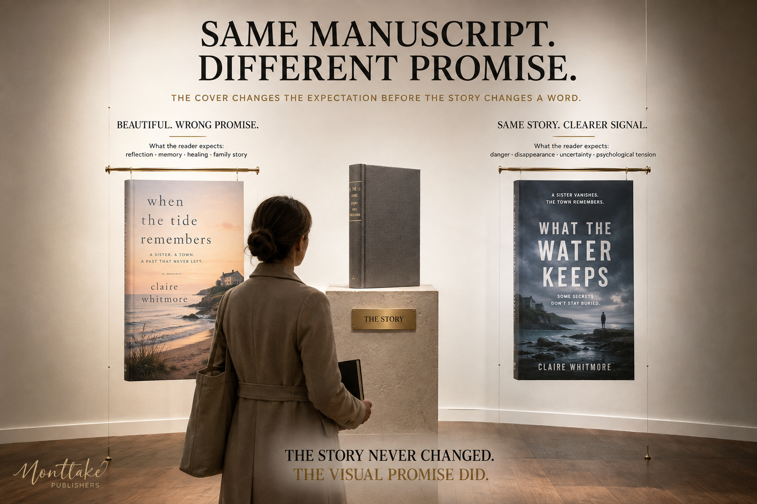
That difference is why genre research should happen before the designer spends hours polishing the wrong direction.
How to Turn Inspiration Into a Professional Cover Brief
1. Collect 15 to 20 Current Comparable Covers
Use books from your actual subgenre, preferably titles competing for similar readers.
Do not collect only covers you personally love.
Collect covers that accurately represent the market too.
2. Mark the Repeating Signals
Look for:
typography
color
character presence
object symbolism
illustration vs photography
title size
negative space
visual density
Patterns will appear quickly.
3. Separate Convention From Copying
Write down what the genre communicates repeatedly.
Then ask what your story can add that those books cannot.
This is where your one memorable element comes from.
4. Test Three Different Concepts
Do not spend the whole budget polishing the first idea.
Concept A might be character-led.
Concept B might use symbolism.
Concept C might be typography-led.
You learn more from three rough directions than from endless adjustments to one weak concept.
5. Test Full Size, Thumbnail, Ebook, and Print
A front cover is not the entire print product.
Amazon's current paperback cover requirements require one PDF containing the back cover, spine, and front cover, while spine dimensions depend on factors including page count and paper choice.
That is why final cover production should happen after the interior specifications are stable.
Where Professional Book Cover Design Fits
Inspiration is easy to collect.
Interpretation is where the work starts.
A professional designer has to translate your manuscript, target audience, genre, competing titles, emotional tone, title hierarchy, imagery, and publishing format into one visual system.
That is also the approach described on Montlake Publishers' Book Cover Design service, where the process considers genre, mood, audience, competitive context, artwork, typography, palette, author feedback, and the final publishing goal.
Cover work can also connect with book illustration when original artwork is central to the project, book marketing when visual positioning needs to remain consistent across campaigns, and book publishing support when final files are being prepared for release.
Final Thoughts
The best book cover ideas do not begin with decoration.
They begin with recognition.
What should a romance reader feel?
What question should a thriller reader ask?
What should make a fantasy reader sense another world?
What tells a parent that a children's book belongs in the hands of a six-year-old?
Genre signals answer those questions before the blurb gets a chance.
Then your story adds the part nobody else can copy: its symbol, character, setting, mood, contradiction, or visual hook.
Use the COVER test before signing off:
Category. Outcome. Visibility. Expectation. Recall.
If the design communicates the right shelf, promises the right experience, survives at small size, respects reader expectations, and leaves one memorable image behind, you are no longer choosing artwork because it looks nice.
You are designing the first decision a reader makes about your book.
Make the Cover Say the Right Thing Before the Blurb Has To
You do not need another folder containing 300 random covers you like.
You need a visual direction that tells your reader what kind of book is waiting.
If your manuscript is ready but the cover direction still feels vague, review Montlake Publishers' Book Cover Design services and discuss the genre, audience, mood, and publishing format before choosing the final concept.
Frequently Asked Questions
What makes a good book cover?
A good book cover communicates genre, tone, audience, and reading experience quickly while giving the reader a reason to look closer. Strong covers balance recognizable category signals with a memorable story-specific idea and maintain clear title hierarchy at both full size and small retail sizes.
How do I come up with book cover ideas?
Start by studying current successful books in your specific subgenre, then note repeated typography, colors, imagery, layouts, and emotional cues. Separate those category conventions from story-specific elements in your own manuscript. Use the combination to develop several different concepts before polishing one direction.
Should my book cover match other books in my genre?
It should usually communicate enough familiar genre information for the intended reader to classify it, but it should not imitate another book. Match the visual language of the category, then introduce a story-specific symbol, composition, character treatment, or typographic idea that gives your book its own identity.
How important is color in book cover design?
Color helps establish mood, contrast, age positioning, and genre expectations, but it cannot carry the whole design alone. The same palette can communicate very different things depending on typography, imagery, composition, and subject matter. Choose color as part of the full visual system.
What font should I use on a book cover?
The right typeface depends on genre, tone, title length, author brand, and composition. Thriller typography often behaves differently from literary fiction or children's books. Prioritize readability and hierarchy first, then use style to reinforce the experience the book promises.
How can I make my book cover stand out without looking off-genre?
Keep the signals readers use to recognize your category, then change one meaningful element. That might be the central symbol, composition, illustration treatment, palette combination, or title arrangement. Standing out works best after readers understand what kind of book they are looking at.
Should my cover show a scene from the book?
Not necessarily. A literal scene may work, but a symbolic object, emotional image, character detail, landscape, typographic concept, or visual metaphor may communicate the book more effectively. The strongest choice is the one that creates the right expectation, not the one that reproduces the most plot details.
How should an ebook cover differ from a paperback cover?
The front-cover concept can remain consistent, but ebook and print production have different technical requirements. Ebook covers appear heavily in digital thumbnail environments, while paperback files must also account for the back cover, spine, bleed, trim size, and page count. Amazon KDP publishes separate guidance for both formats.
Is professional book cover design worth paying for?
Professional design can be worthwhile when the book will compete commercially and the author lacks the skills to research genre positioning, typography, composition, image rights, print production, and retailer requirements. The value comes from informed design decisions, not simply access to design software.
Can Montlake Publishers design a cover around my genre and story?
Montlake Publishers provides professional book cover design services built around the manuscript's genre, mood, audience, visual direction, typography, imagery, palette, author input, and publishing goals. Authors can discuss the project before deciding which cover direction fits the book.


